Dev log writing, hello everybody! It’s danish. Once again, I’m posting a dev log in the middle of the night but who would really know that right?
Anyhow, this dev log will highlight the “importance of colour” and other “visual aids”, and how I’m using that to enhance my game.
Colour is everywhere, we see it everyday and interact with it everyday. Whether you can see the whole spectrum, or only a few, colour still impacts you. Below- I have included videos that really inspired me and made me really think about how important colour is in not our daily lives, but also how they shape our experiences, or even behaviours.
(yes they’re TED talks but I love TED talks-)
Because I am making my game in Twine, it’s a text based game (and only will be text- as I don’t have enough time to implement other visuals), I found that colour is super important, as well as the typefaces, and what the players see.
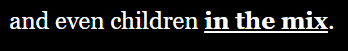
With that being said, I used a lot of colour in my game, and also accompanied with effects or different sizes. It makes it easy for the player to know who is talking, since there are so many characters, along with so many point of views. It lets the player know “oh ok- this is who is talking”.
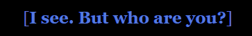
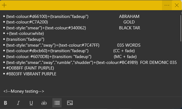
I have chosen to keep the main narrative in white, “CC” who is “supposedly” the voice in your head, and the main character (YOU the player) a nice purple (which includes both dialogue and actions you take).


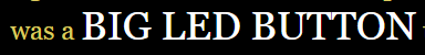
In addition, I have also added different size text(s) for other effects such as highlighting emphasis, or highlighting the size of the object being described.
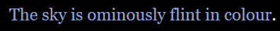
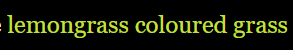
I also decided to add a little detail on “coloured” words as well, such that a colour word will actually be its own colour. This helps aid the player in imaging the scenario, cause they have some idea of what colour it is suppose to be.
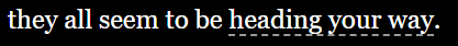
In addition to the coloured text, and the different sizes- in terms of quality of life things, I have decided to add additional underlines for interactive text (ie. you can click it, or hover over it). I found that the bolding was super hard to see (as a play tester myself) so I went through and made sure to add such things.
Some text also has additional effect to increase its meaning, and also the meaning behind the word. For example (see Fig 10.10), the word “the source of the red light” is not only red, but also “glowing”, symbolizing “wow, it’s actually a light”.

It’s also good to make a quick note, that I tried not to use “obnoxious” or “eye hurting” colours for the main part of the text. As somebody who starts at a screen almost everyday, I rather not hurt my eyes reading hot pink text on a neon green background. Maybe for a few selected words, but for a whole passage- that seems like too much for me.
I’m trying to not spoil too much of the actual story through the screenshots- but these are some of small details I’ve decided to add to the game to make it a little more than just “some text on a black background”
OVERALL UPDATES
At the time writing this, I have finished half of Act I (I think?). about 31/102 pages. (yes it increased- finally had time to finish some of the endings) One third of the way there though!
I have also made an inventory system (which is a little scuffed at the moment), and a functional save system!
I have also made a currency system, and additional prompts for purchases where you don’t have enough money.
Besides all those cool features, I have also added additional/ extra text if you re-enter an area. For example, if you return back to a certain merchant, instead of a first time greeting, they’ll great you with a “Oh hey it’s you- you’re back- want to buy something?”
For those who are asking “how are you keeping this consistent?”. My friend, I present to you-
THE STICKY NOTE OF COPY PASTE CODE
That’s it for this dev log, maybe the next one will include my messy code? We’ll see 🙂
See you guys in the next one!
– danish
Editors Note: Dev log #11 is out! Go check it out 🙂
Leave a Reply
You must be logged in to post a comment.